Audio descriptions: Artworks in the exhibition Minefiled: The Art of Mona Ryder
Mona RYDER Mother Other Lover 1995, painted metal and acrylic sheet, neon. Griffith University Art Collection. Donated through the Australian Government’s Cultural Gifts Program by the artist, 1999.
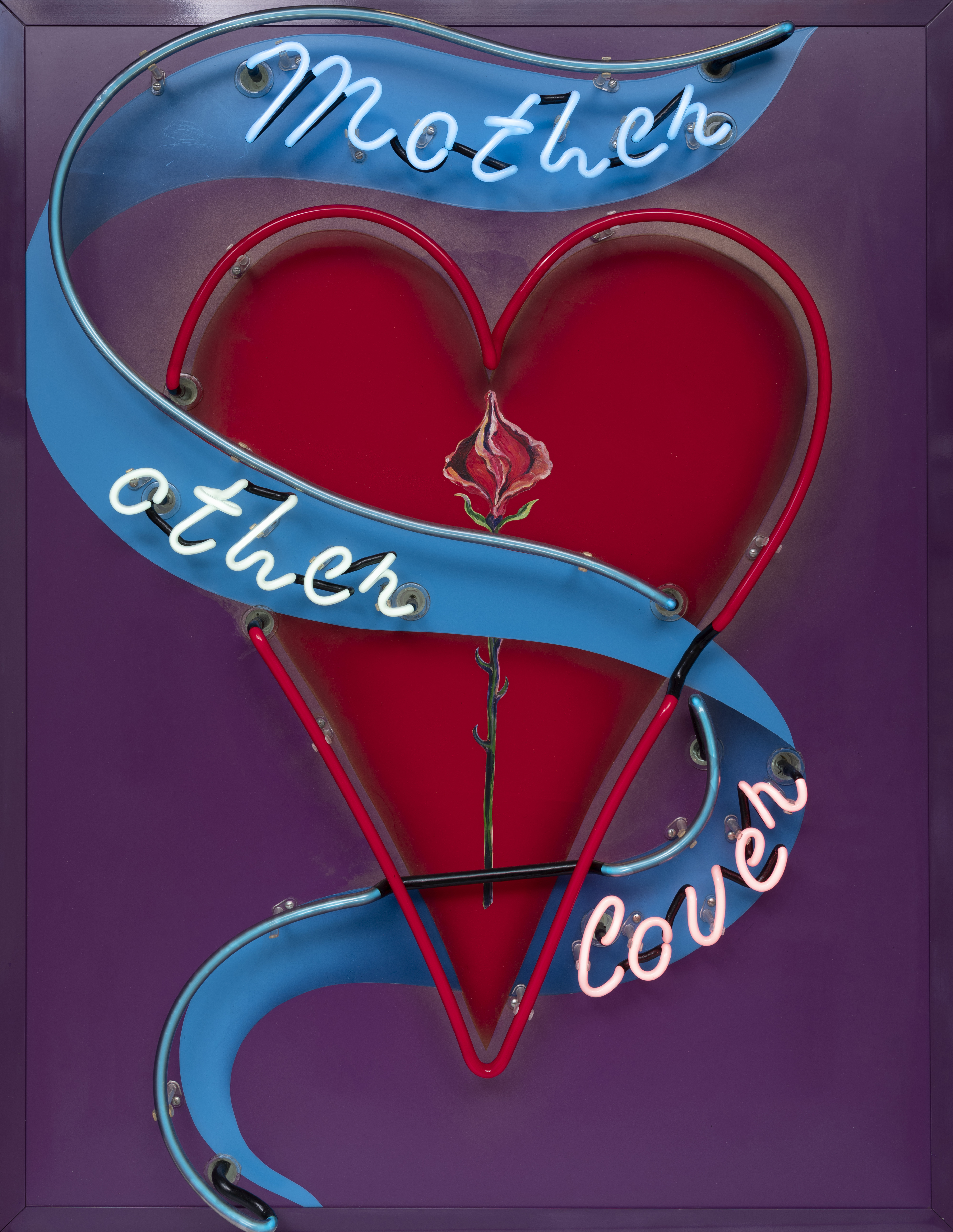
Mother Other Lover by Mona Ryder, 1995.
This work is a painted metal and acrylic sheet with neon elements and the measurements of 110 centimetres in height, 84.5 centimetres in width and 20 centimetres in depth. The work is situated in the window on the left-hand side next to the entrance to the art museum and can only be viewed from outside the art museum.
Neon lettering in cursive script follows the shape of a blue ribbon or sash starting from the top right-hand corner to the bottom left-hand corner of this work. The writing follows the shape of the blue ribbon as it winds around the central feature of the work, a red neon flashing light moulded in the shape of a heart.
The inside of the heart shape is painted a deep red. Running from the top to the bottom of the work we discover three words presented in different colours of neon light written on the sash. Beginning above the heart we find the word ‘Mother’ rendered in blue. Moving across the left-hand side of the sash is the word ‘other’ in white neon and twisting back on itself is the word ‘lover’ in red neon. The ribbon snakes and moves down, through and across the work like the tail of a kite shifting in the wind and in colour and shape like that of a tattoo. The outline of the heart shape is rendered in neon however only the neon of the heart is flashing, resembling that of a beating heart.
Nestled within the red heart shape and running down its centreline is a painting of a single red rose. Distinctly produced by the artist’s hand the rose gives the work a personal touch, feel and individual quality. The rose is unfurling with delicate petals outlined in fine pink and white painted lines. The heart, sash and wording is illuminated in front of a deep purple background with a painted purple acrylic metal sheet frame.
The artist explains, “I don’t believe in naming every piece of my work or giving everything a title because I would rather write on it or integrate it…. I want people to have their own imaginations, their own feelings to get something from it, rather than have me imposing something. So, when I use text, it usually has more than one way you can read into it.”